Tuesday, 23 October 2007

Pizza Planet


Here are some images of Pizza Planet I got from an Art of Toy Story book. I thought these restaurants were really googie and would serve as good research.

Concept work


These are some concept sketches I did at the weekend of the restaurant and the sign. As you can see I also couldn't resist doing some sketches of the character as well.

Friday, 19 October 2007

Storyboard


We finally have an idea that works. The group has decided to use the abandoned 50's diner motif and combine it with the Nevada Desert. The Rough Script is as follows.

Ext: Nevada Desert

A man is looking at a map. He has been on a fifty year search to find the world's greatest pickle.

The map folds down to reveal the diner. Tumbleweeds blow in.

The man walks up to the door. A sign above the door states "home of the world's greatest pickle"
Excitedly the man opens the door as the camera pans in
INT: Diner
The diner has been abandoned for years. The desert wind blows the curtain. The Toilet door slams in the wind and half-empty glasses roll off the tables. Shocked the man walks through this. His eyes glance at the jukebox, which is still emitting a neon buzz. One record is not broken, he decides to play it.
The music comes blasting out and startles him. He fumbles and knocks the counter, he hears a crash. He looks behind the counter to see a old pickle jar on the floor broken. He pans across rows and rows of broken jars until he finds one perfect jar.
Slowly he lifts it up to the counter. He slowly takes off the lid and produces the perfect pickle. Slowly he moves to his mouth to eat it and the camera pans away as he happily munches his long sought after pickle.
End

Expressions


Here is a rough expressions sheet I did for the bloke model. It helps me prepare for doing the storyboard.

Monday, 15 October 2007

Test Animations

I downloaded this rig called bloke from

www.3Dcentral.com.

It's a really good rig, fully posable, a wide range of easily controlled facial expressions and it even stretches. It's so much better than anything I ever made.

He's a bit grey and naked, but Mike said it doesn't have to look like it fits in with the backgrounds.

I have done two tests, one a walk cycle, the other an expressions test.


Lou Romano


I need some help on how to tone done colours and how to use light but luckily I found some pastels that Lou Romano did (he was the production designer on The Incredibles by the way) when he was working on the powerpuff girls. Here he really plays with the light and shows how you can tone down colours.

All images obtained from louromano.blogspot.com


New Research

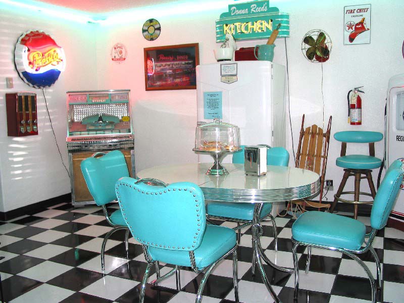
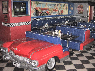
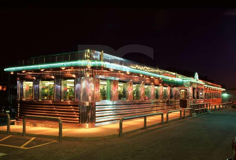
For my new idea, I had to look specifically at restaurants from the 1950's. Luckily, my old research can remain useful as Googie architecture was very prominent at this time. Restaurants at this time were usually characterised by a few characteristics.

1. Bright, primary colours

2. White walls

3. Clean

4. Curves

5. Leather

6. Crome metal

7. The kitchen is visible to the customers

8. Neon


So to make it look run down , we would have to break these curves, tone down the colours and dirty up the place.


Here are some of the images I used as inspiration.